
This week, to provide research, we were asked to review the art block's exhibition of final pieces for this years' A level graduates and file reports on two pieces we found interesting...
The first piece that stood out for me was a project by Alice Luscome; based on a small vintage clothing shop Beyond Retro. Her aim was to re-brand the store to make it stand out amongst other clothing retailers - due to its' evident lack of advertising.

What I really love about this work is it utilizes smart ideas rather than loud, flashing graphics to make the design stand out. Even the colour scheme is simple and there are no complicating textures in the background - which is nice because I feel it reflects the vintage style of the shop perfectly (and was therefore most likely intentional!). Finally, the idea behind the animal heads on the models is just brilliant! And I love the way they're linked into both their own posters and to each others' through the tag line "Stand out from the..." followed by the appropriate mass noun to represent the group formed by each animal. I think this is a really fun idea which has been well executed.

This campaign was followed by a range of merchandising - including T-shirts, canvs bags and multi-purpose tags. Again, there are some really smart ideas behind the merchandising - particularly the tags; which I LOVED! They've been printed with messages, again following the same simple, vintage style, reading "You look lovely today DON'T HIDE" and "Stick this on someone you think looks lovely". I thought this was such a fun and friendly idea for an advertisement campaign because not only is it innovative in reaching out to potential customers on a more personal level, it's completely practical, cost-effective and just generally a really lovely idea!
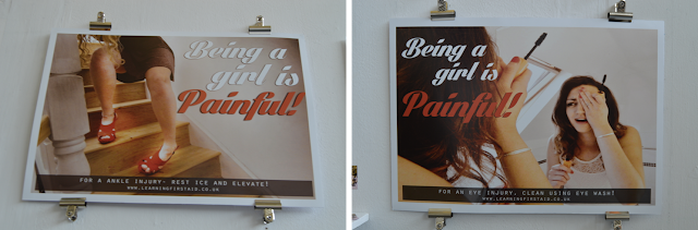
The second project I really loved was by Beth Dobson aimed at re-branding first aid in order to promote its' usefulness to the younger generations of today. Her inspiration stems from her experience as a lifeguard; and while learning first aid she realized its' importance to young people.

The second project I really loved was by Beth Dobson aimed at re-branding first aid in order to promote its' usefulness to the younger generations of today. Her inspiration stems from her experience as a lifeguard; and while learning first aid she realized its' importance to young people.

What she came up with is a really smart series of photographic posters. Firstly, I think these are great conceptually because they target young people instantly with their strong images and captions since they depict common problems that people at this age can identify with - then they provide the essential information of how to solve these problems to prove the importance of first aid. Secondly, I really love the colour scheme; a muted, low contrast image under white and red text to make the tag line stand out and a black bar along the bottom to deliver the serious information combined with an appropriate, and well-placed, typeface to create a vintage style.

This campaign was also accompanied by a brilliant set of business-card-style handouts and leaflets containing both innovative and creative visuals and helpful information.
No comments:
Post a Comment